Data visualization tools that support analysis and expression
(*As of April 2026)
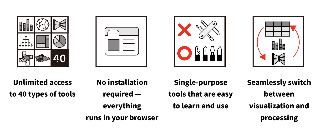
- Broad coverage from charts, maps, networks, and text visualization
- No installation required — everything runs in your browser
- Single-purpose tools that are easy to learn and use
- Support for visual expressions that are hard to create in Excel or general BI tools
What can you create?
2023 Advertising Spending by Industry (Four Major Media)
View the advertising spend scale across 21 industries and 4 major media types in a single chart. This type of chart is called a mosaic plot (or Mekko chart), which allows you to cross-tabulate two variables in one chart.
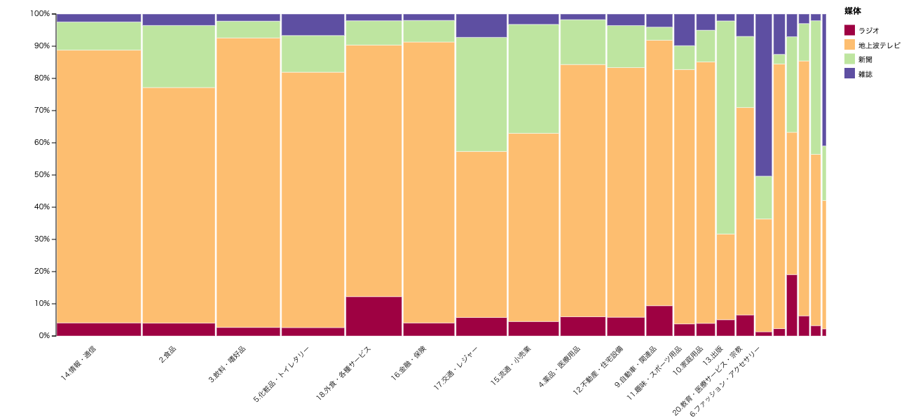
Mosaic Plot / RawGraphs
Distribution of Home Middle Schools by Prefecture for Koshien Tournament Players (Tohoku Region)
The left side shows Koshien participating schools, the right shows the home prefectures, and line thickness represents the number of players. Colored lines indicate movement within Tohoku, while gray lines indicate movement from outside the region. It can be created with a simple data format.
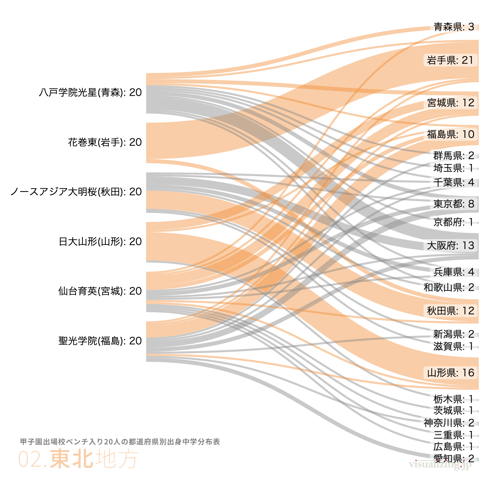
Sankey Diagram / Sankeymatic
Popular Dog Breeds
Dog breeds are classified in a phylogenetic tree, with the size of the circles at the tips representing popularity. This is one of the chart types for expressing tree (hierarchical) structures. The beautiful data-driven curves are difficult to draw manually with design tools.
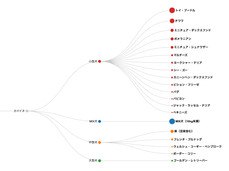
Linear Dendrogram / RawGraphs
AirBnB Property Types and Accommodation Costs
3D maps are also easy to visualize. By simultaneously expressing multiple variables through color, size, and height, it becomes easier to grasp multiple aspects at once.
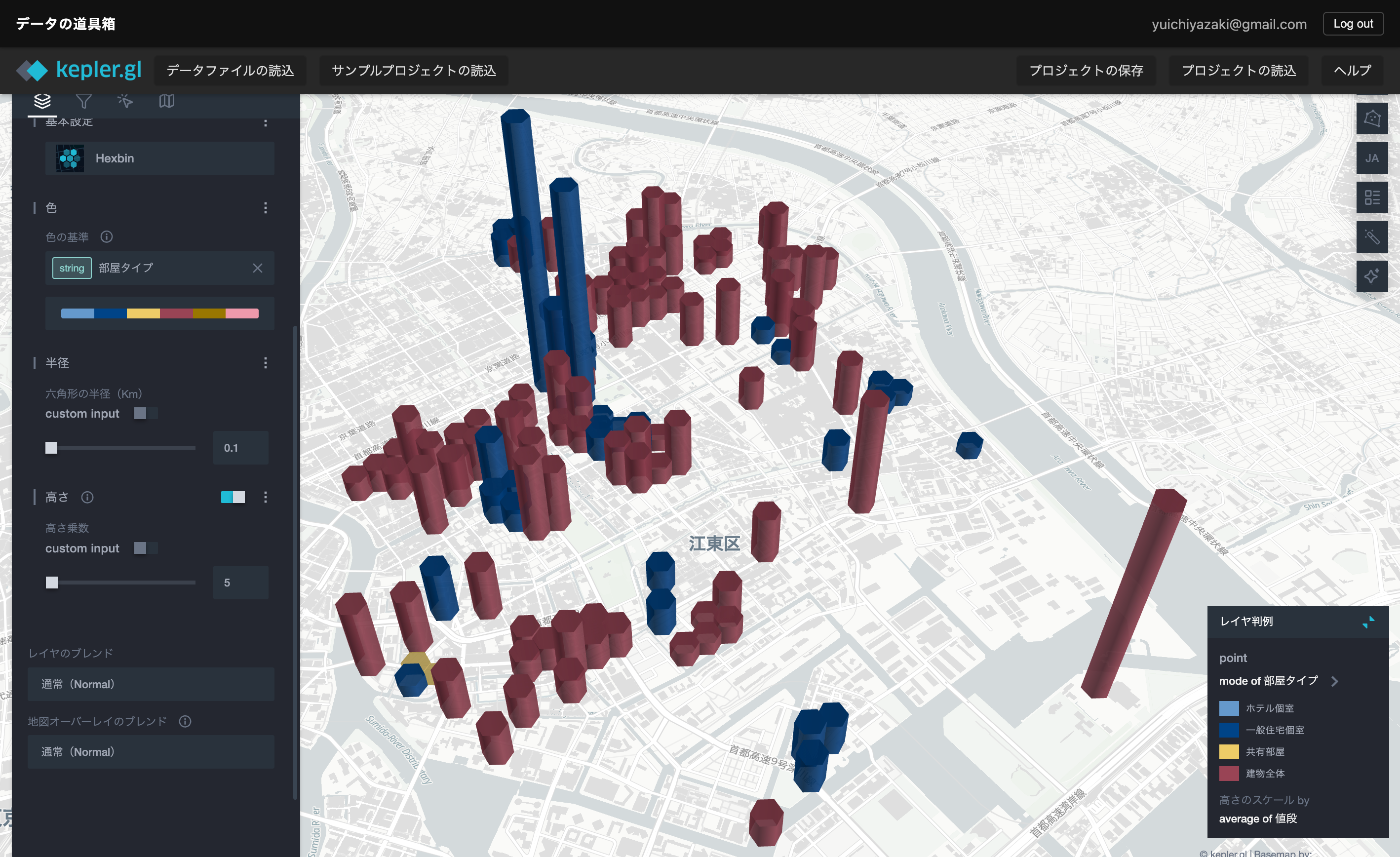
3D Bar Chart Map / Kepler-GL
Does this sound like your data workflow?
- You discover useful chart types, but your current tools don’t support them
- Excel only covers basic charts, making your output feel repetitive
- BI tools are powerful, but too heavy for quick visualization work
- Maps, networks, and text visualization feel out of reach
- There are large skill gaps within your team when it comes to visualization
Four key features that solve these problems
Four key features
✅ A wide range of data visualization tools
From chart creation, map display, color design, networks, text visualization, and specialized visual expressions.
✅ No installation required — everything runs in your browser
No software installation needed — everything is accessible through your web browser.
✅ Single-purpose tools that are easy to learn and use
Each tool is focused on a single function. This dramatically reduces the time spent learning complex operations and configurations. We prioritize simplicity so that teams with varying levels of data literacy can start using them right away.
✅ Explore visualization ideas entirely in the browser
Upload data, choose a visual expression, and adjust the output while seeing the result. Your visualization workflow stays in the browser.
Why this service? (Comparison with Excel, Tableau & Python)
| Aspect | Excel | Tableau / BI Tools | Python / R | Data Visualization Toolbox |
|---|---|---|---|---|
| Ease of setup | ◎ Ready to use | △ Installation required | × Environment setup needed | ◎ Instant use in browser |
| Learning curve | ◎ Low | △ Training required | × Programming required | ◎ Intuitive single-purpose tools |
| Chart variety | △ Basic charts only | ◎ Many | ◎ Many | ◎ Basic charts plus unique charts you can’t make elsewhere |
| Setup | ◎ Not needed | △ Software installation | × Environment setup | ◎ Not needed |
| Price | ◎ Many existing users | × Expensive | ◎ Free | ◎ Affordable subscription |
| Team adoption | ◎ Possible | ◎ Possible | △ Engineer-dependent | ◎ Anyone can use it |
| Target users | Office/general work | BI analysts | Data scientists | Office/general work, marketing, government, researchers, journalists, and more |
What Data Visualization Tools Can Do
It’s not just charts. We cover a wide variety of visual expressions.
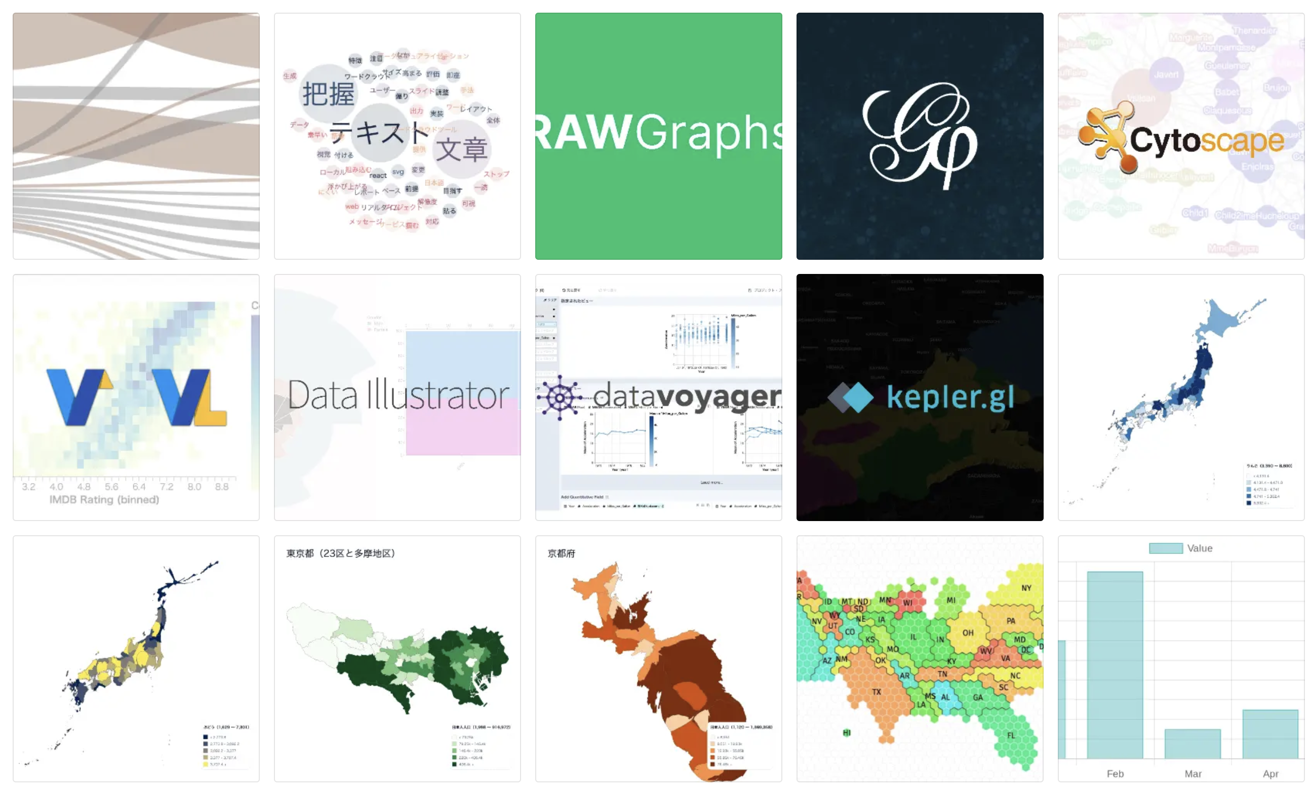
Data Visualization Tools
- Create various types of charts
- Perform exploratory data visualization
- Visualize data on 3D maps
- Create data maps at the prefecture or municipality level
- Visualize networks
- Visualize text data
and more.
See the Choosing the Right Data Visualization Tool page for details.
Workflow supported by this service
Data Acquisition
We provide sample data and commonly used datasets in formats suitable for visualization.
Data Visualization
Even when you know about useful chart types, your existing tools often can’t create them. We focus on such charts and make them easy to create through templates.
Data Portal
We provide a data portal with sample data for learning, and another with original datasets for practical use.
Elevate your team’s data literacy
By using a common set of tools, you build a foundation for improving not just individual skills, but your entire team’s data literacy.
- ✔ Prevent data workflows from becoming a black box
- ✔ Reduce dependence on specific individuals
- ✔ Enable junior members to work with data
- ✔ Speed up decision-making across the entire department
Multi-User Plans
We offer multi-user plans for teams and departments. The subscriber becomes the leader and can share project files with other members.
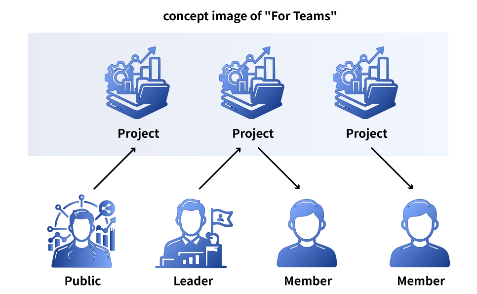
- ✔ The subscriber (leader) shares projects with the team
- ✔ Members can independently edit and save shared projects
- ✔ Accounts for members are issued after subscription (migration of existing users is also available)
- ✔ Choose from plans for 5, 10, or 30 members
See the Pricing page for details.
About the Creator
Developed over one year by a data visualization practitioner.

- Author of “The Complete Guide to Data Visualization Basics” (Japanese)
- Organizer of Data Visualization Japan
- Lectures on data visualization at universities
- Corporate data visualization training and presentations
See the About page for details.
Pricing
Visualization Plan: $8/month
See the Pricing page for all plans.
FAQ
What is Data Visualization Toolbox?
We provide a wide range of nimble data visualization tools for charts, data maps, network diagrams, text visualization, and more — more diverse than Excel and easier than BI tools. Everything runs in your browser, and you can use the tools as much as you want with a flat-rate subscription.
Who is this service for?
This service is for anyone who works with data.
- People who want to create charts that Excel can’t make
- People who want to visualize data without programming languages like Python
- People who want specialized visualizations such as maps, networks, or text
- It can be used for a wide range of purposes including general documentation, marketing, government, research, and data journalism.
See the FAQ page for all frequently asked questions.