← Back to Catalogue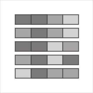
Heatmap
Heatmap
Numeric
Tools that can create this chart…

Data values are represented by color within a grid of tiled rectangles. This chart is not for examining correlations; rather, it displays colors in a sequential order, such as from top-left to bottom-right like a calendar. Although it looks similar, the chart used for examining correlations is called a correlogram.