
What is this tool?
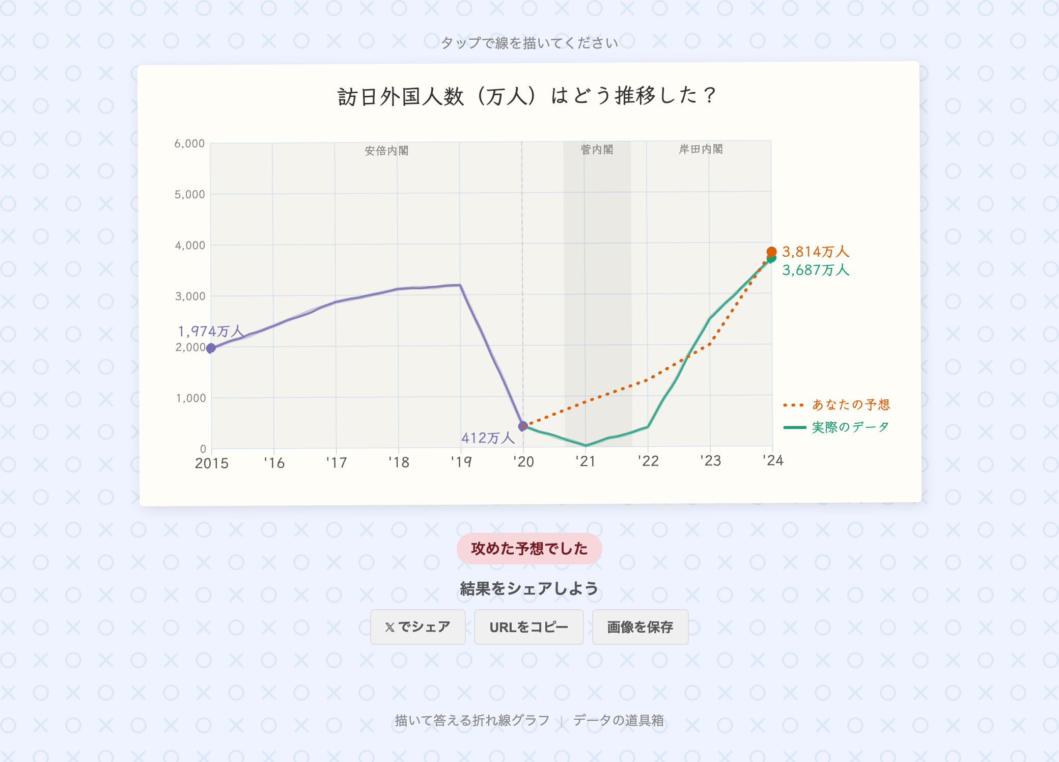
“Draw-to-Answer Line Chart” is an interactive quiz builder based on time-series data. Quiz creators upload their data, and respondents predict upcoming trends by drawing directly on the chart. After submitting, the prediction is compared against the actual data and a score is displayed.
Features
- CSV upload: Create quizzes from your own time-series data
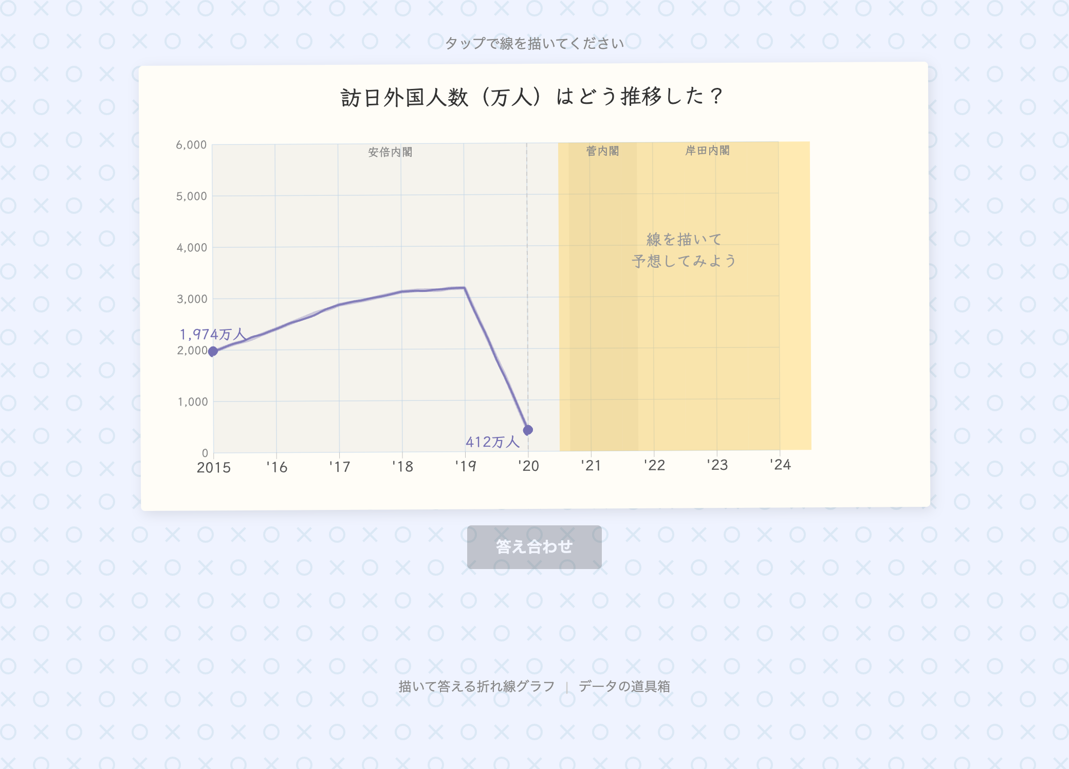
- Sample data: Try it instantly with built-in datasets — U.S. unemployment rate, Japan’s population, inbound tourists to Japan, and USD/JPY exchange rate
- Date range selection: Select a portion of the data to define the quiz scope
- Period annotations: Overlay contextual labels on the chart, such as political transitions or economic events
- Hand-drawn style: Choose between a standard style and a hand-drawn sketch style
- Publish & share: Share your quiz via URL or on social media
- Project save & load: Save work-in-progress quizzes and resume editing later
How to use
- Upload data — Drag & drop a CSV file or select a sample dataset
- Set the date range — Specify the start and end of the data range
- Configure the quiz — Enter a title (question), the prediction start point, units, and style
- Add annotations (optional) — Set period labels to display as background context
- Preview — Check the chart in real time on the right panel
- Publish — Generate a URL and share it with respondents
Data format
CSV files with a header row are supported.
| Column | Content | Example |
|---|---|---|
| X-axis (time series) | Year or year-month | 2000, 2020/04 |
| Y-axis (numeric) | Any numeric value | 4.9, 12615, 105.21 |
date,value
2000,4.0
2001,4.7
2002,5.8
- X-axis supports YYYY (year) or YYYY/MM (year-month) formats
- For multi-column CSVs, you can select the X-axis and Y-axis columns after uploading
- JSON format is also supported ([{“x”: 2000, “y”: 4.0}, …])