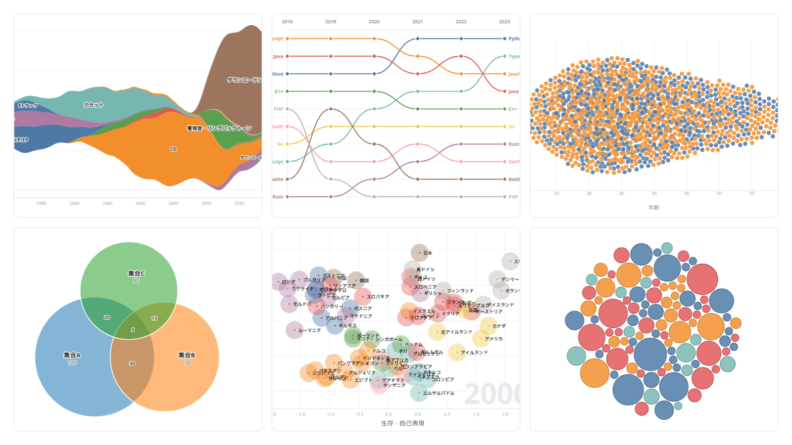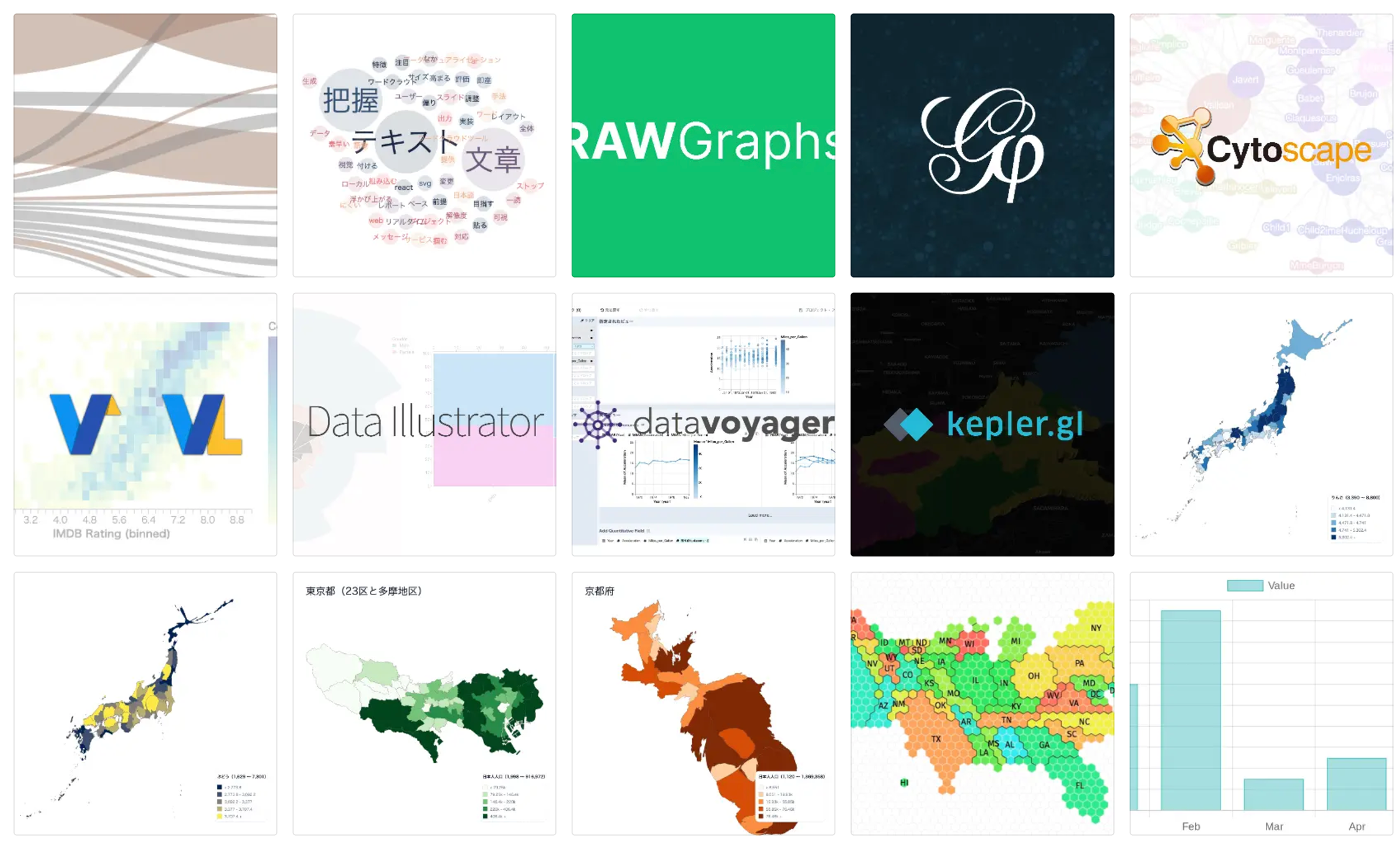
Data Visualization Toolbox supports both familiar charts and specialized visualizations through focused browser-based tools.
- Build different chart types
- Visualize hierarchical data
- Visualize a crosstab matrix
- Explore relationships in data
- Create 3D visualizations and maps
- Build data maps
- Visualize networks and flows
- Visualize text
- Work with visualization specifications
- Create animated visualizations
Build different chart types
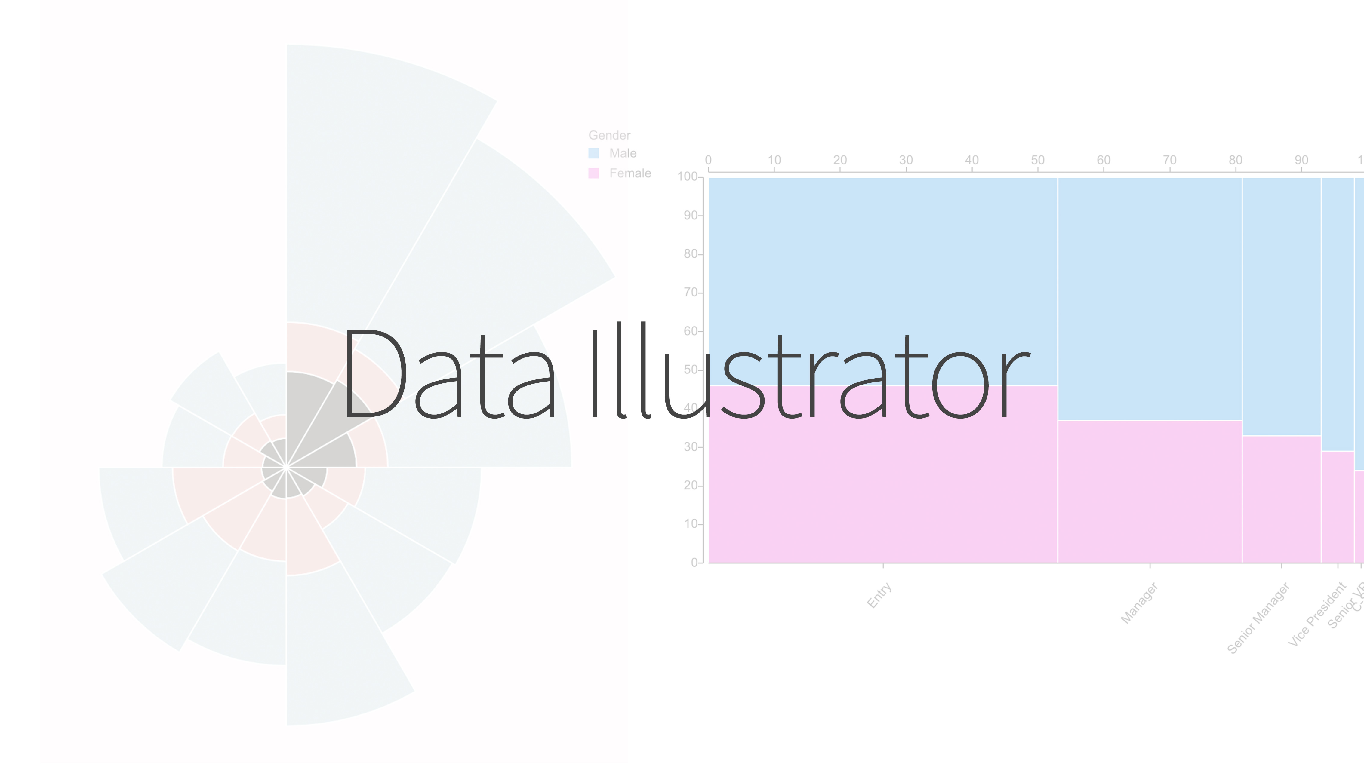
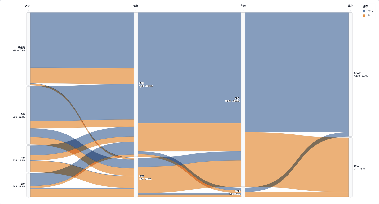
Create familiar bar and line charts as well as Sankey diagrams, mosaic plots, linear dendrograms, and other visual forms that are difficult to build in spreadsheets.

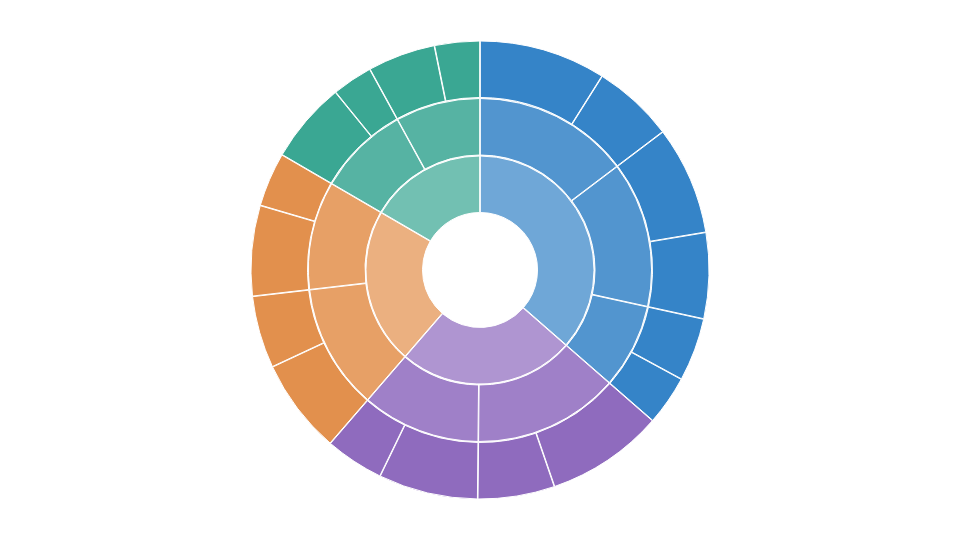
Visualize hierarchical data
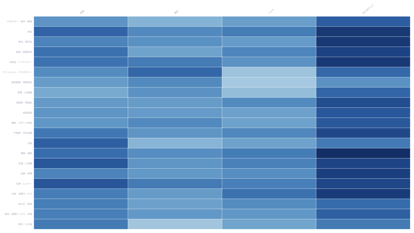
Visualize a crosstab matrix
Read a row × column crosstab without converting it to a list, as a heatmap, mosaic, chord diagram, and more.
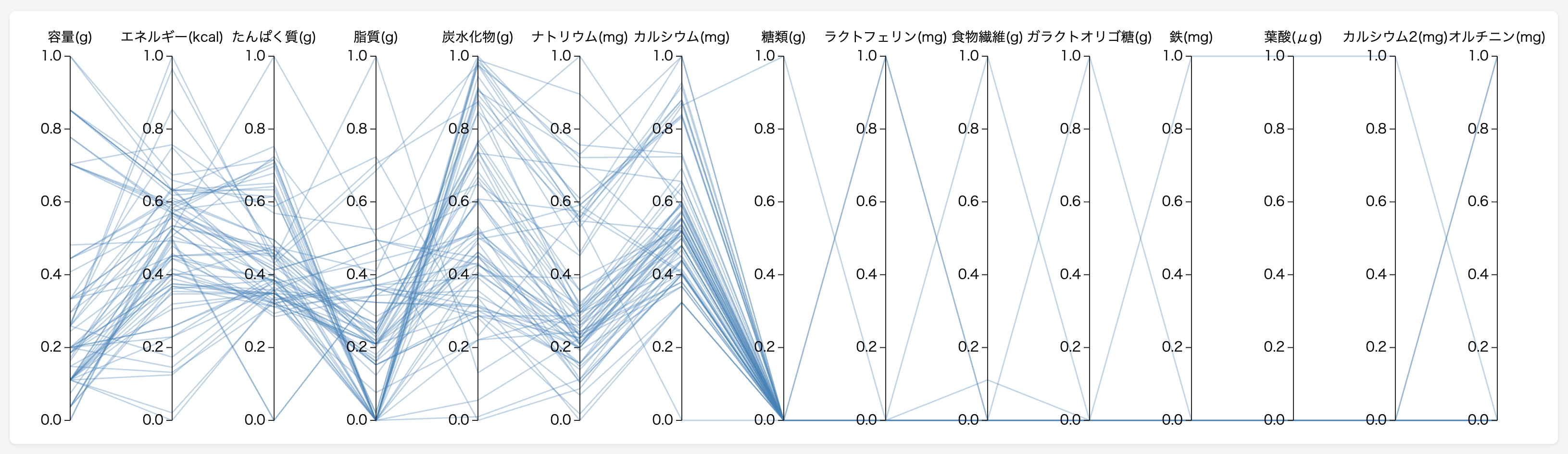
Explore relationships in data
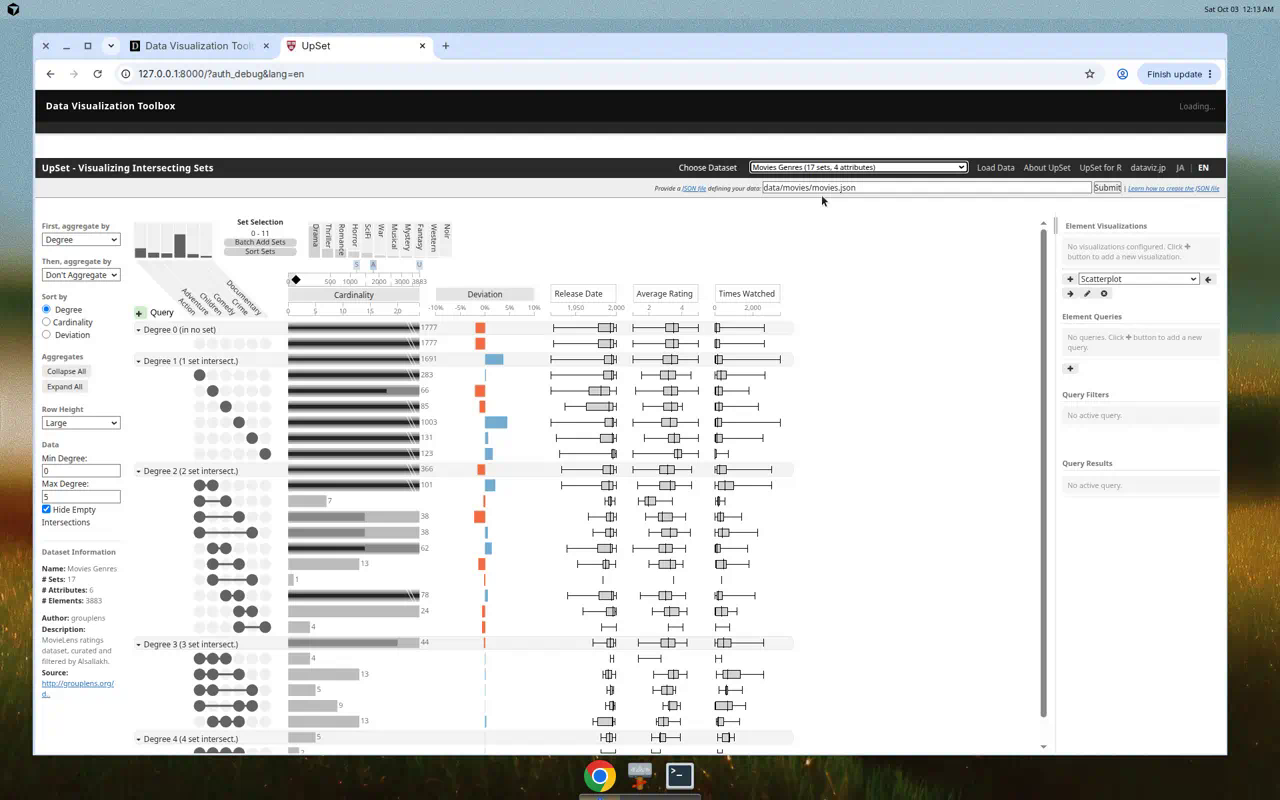
Use exploratory visualization tools to investigate relationships among variables and support exploratory data analysis (EDA).

Create 3D visualizations and maps
Use height, color, and position together when a three-dimensional view helps communicate multivariate or geographic data.
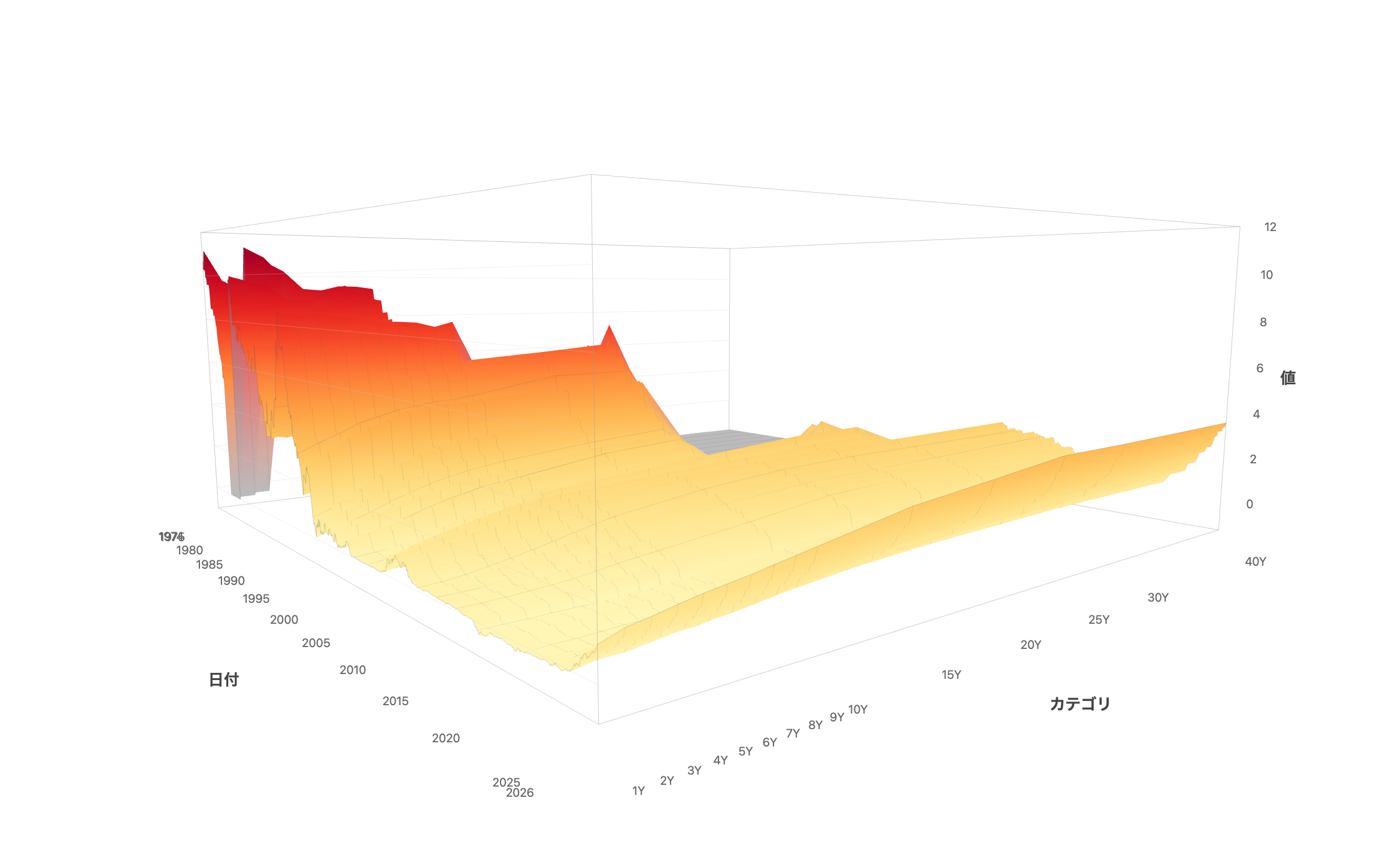

Build data maps
Create maps for Japanese prefectures and municipalities, including choropleths, cartograms, and tile-based maps.
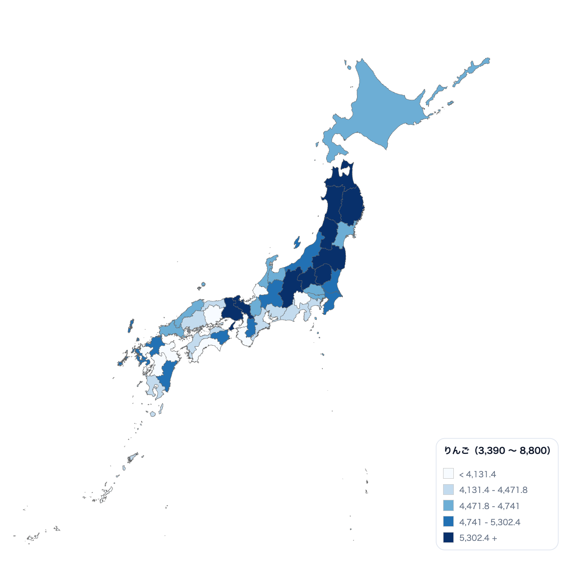
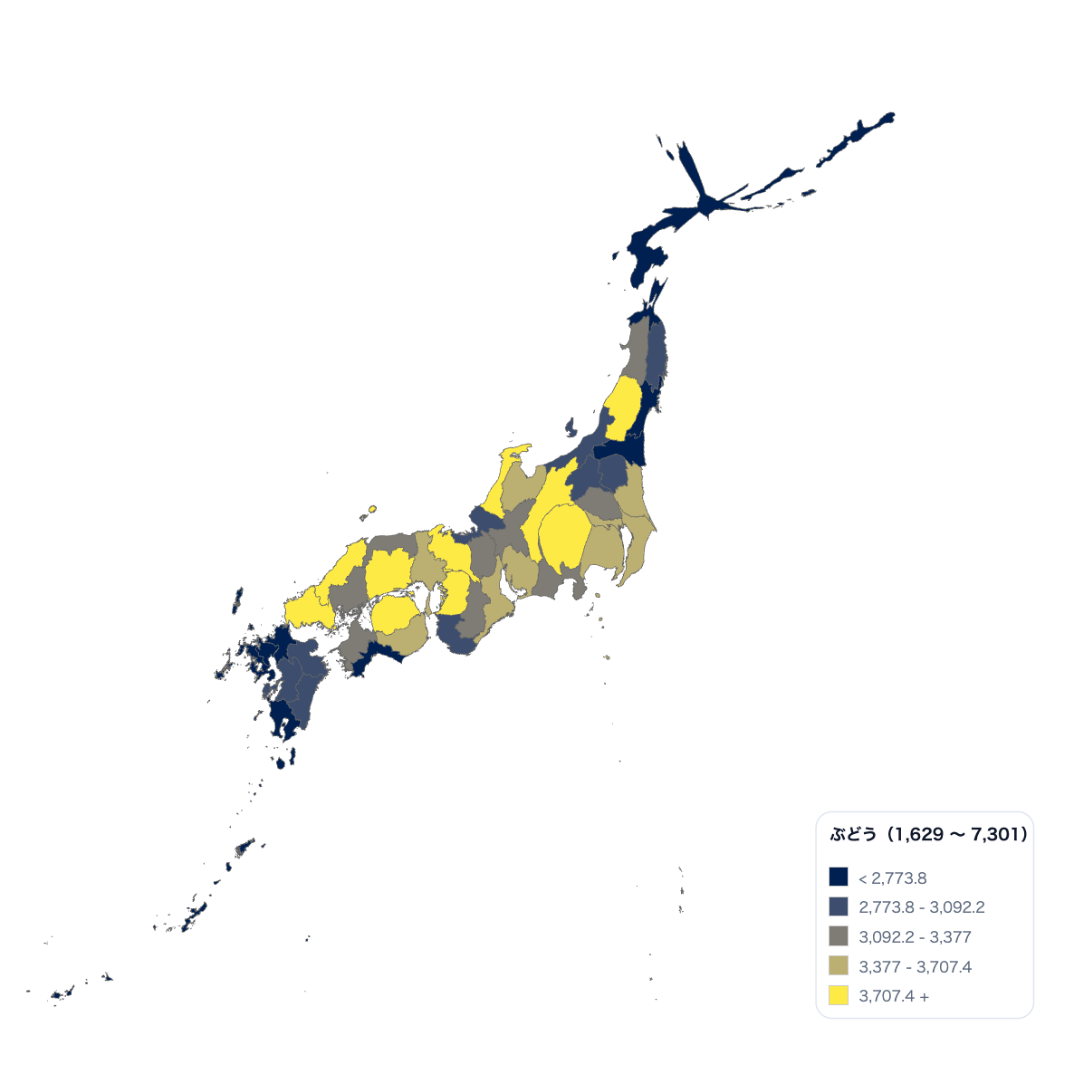
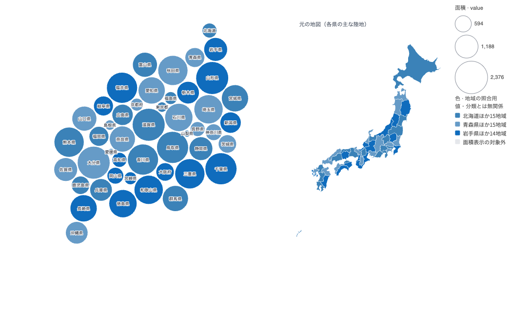

Movements and trade between places can be drawn as directed, weighted flows. Two-way flows with different values stay readable, and world maps are supported too.
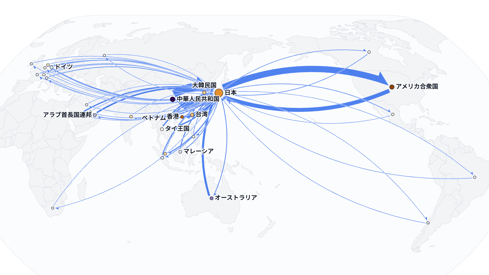
Visualize networks and flows
Represent relationships as nodes and edges, or show flows between categories with Sankey diagrams.


Visualize text
Show frequently used words and other patterns in text data.

Work with visualization specifications
Use tools that describe visualizations with JSON specifications or generate chart images from URLs when a programmable workflow is useful.


Create animated visualizations
Turn aircraft or vessel tracking data into animated geographic visualizations.

Build interactive, animated charts from templates, such as a timeseries scatterplot with playback or a streamgraph.