40 specialized tools* support your data workflow from end to end.
(*As of March 1, 2026)
This is not just a collection of “data visualization” tools – it also supports “data processing.” It is an all-in-one service of specialized tools that let you intuitively handle everything from data preparation to visual expression.
Does this sound like your data workflow?
- You discover useful chart types, but your current tools don’t support them
- You’re exhausted by preprocessing before you even get to visualization
- Extracting tables from PDFs is a struggle every time
- You have address data but can’t plot it on a map
- Data processing in Excel has become dependent on specific individuals
- There are large skill gaps within your team when it comes to data
Why use our tools? Three key strengths
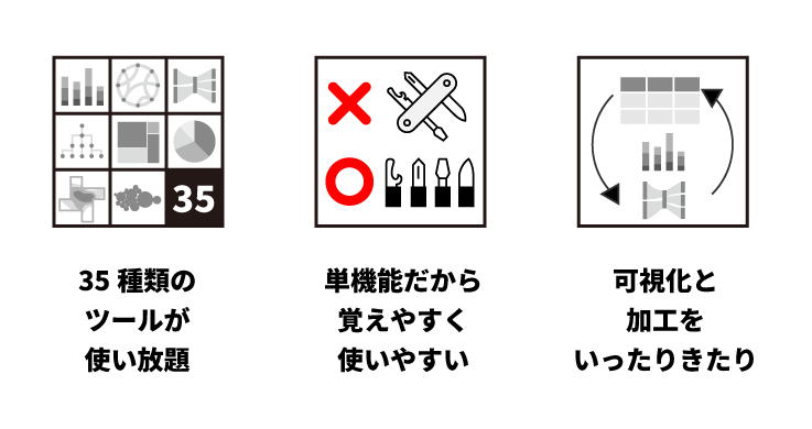
✅ Unlimited access to 40 types of tools
From chart creation, map display, and color design to specialized visualization expressions. Data processing, formatting, and conversion tools are also included. No software installation required – everything is accessible through your web browser.
✅ Single-purpose tools that are easy to learn and use
Each tool is focused on a single function. This dramatically reduces the time spent learning complex operations and configurations. We pursue simplicity that keeps the learning curve low, so teams with varying levels of data literacy can start using them right away.
✅ Seamlessly switch between visualization and processing
To tackle various visualizations, you need to prepare data suited to each purpose. Since visualization alone or processing alone is rarely sufficient, we also provide practical tools for trial-and-error data preparation for visualization.
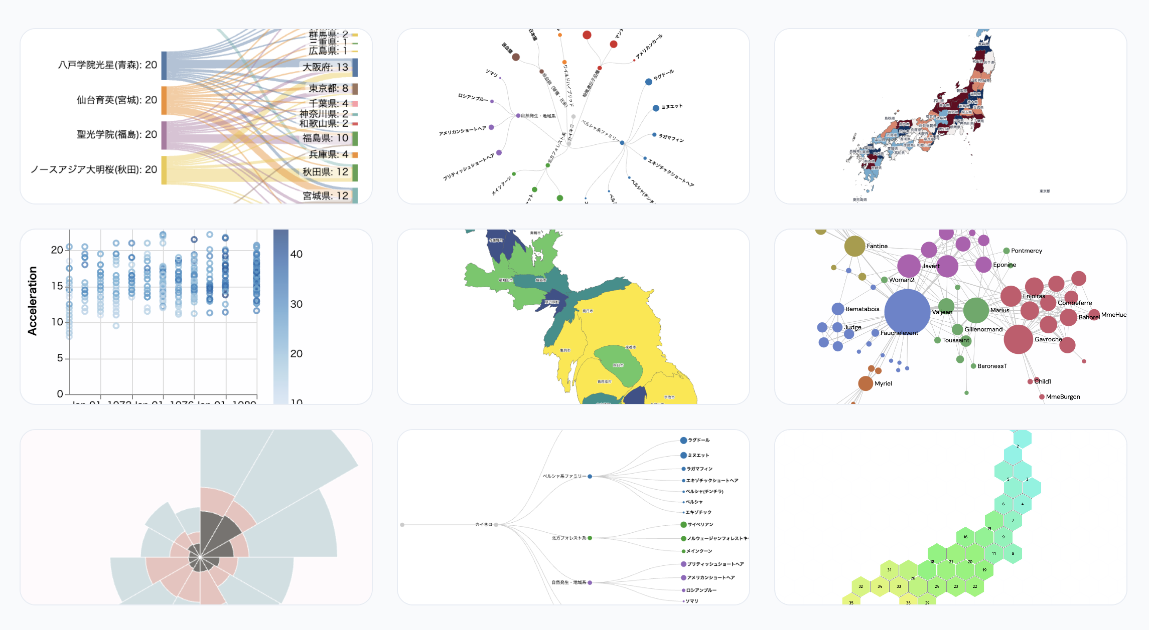
Data Visualization
It’s not just charts. We cover a wide range of visual expressions.
- Chart creation tools: Visualize with basic charts such as bar, line, and scatter plots.
- Map visualization: Visualize location data on data maps as accurately and effortlessly as possible.
- Network (relationship) visualization: Ideal charts for representing interpersonal relationships, corporate connections, and more.
- Specialized visualizations: Mosaic plots, dendrograms, etc.
- Color palette / color design tools: Help anyone choose colors suited to the nature of their data. Generate color palettes that prioritize readability and accessibility.
With diverse visualization methods, you can transform data characteristics, trends, and relationships into forms that are instantly understandable.
Data Processing
Improving data quality before visualization directly impacts the accuracy of results.
- General-purpose formatting and conversion tools
- Formatting and merging tools specialized for map data
- Easy and accurate table data extraction from PDFs
- Geocoding: add latitude and longitude from address data
With tools specialized for each use case, you can minimize the hassle of data preparation.
Elevate Your Team’s Data Literacy
By using a common set of tools, you build a foundation for improving not just individual skills, but your entire team’s data literacy.
- Anyone can use them
- Hard to make mistakes
- Clear purpose
- Reproducible results
As a result:
- ✔ Prevent data workflows from becoming a black box
- ✔ Reduce dependence on specific individuals
- ✔ Enable junior members to work with data
- ✔ Speed up decision-making across the entire department